Beat nik
Magazine
/ Project Specifications
- Category
- Typography + Layout
- Substrate
- Mohawk Superfine
- Colors
- 1 Spot + Black
- Finishing
- Perfect Bound
- Client
- Beat nik
- Artist
- INTYPE Print Studio
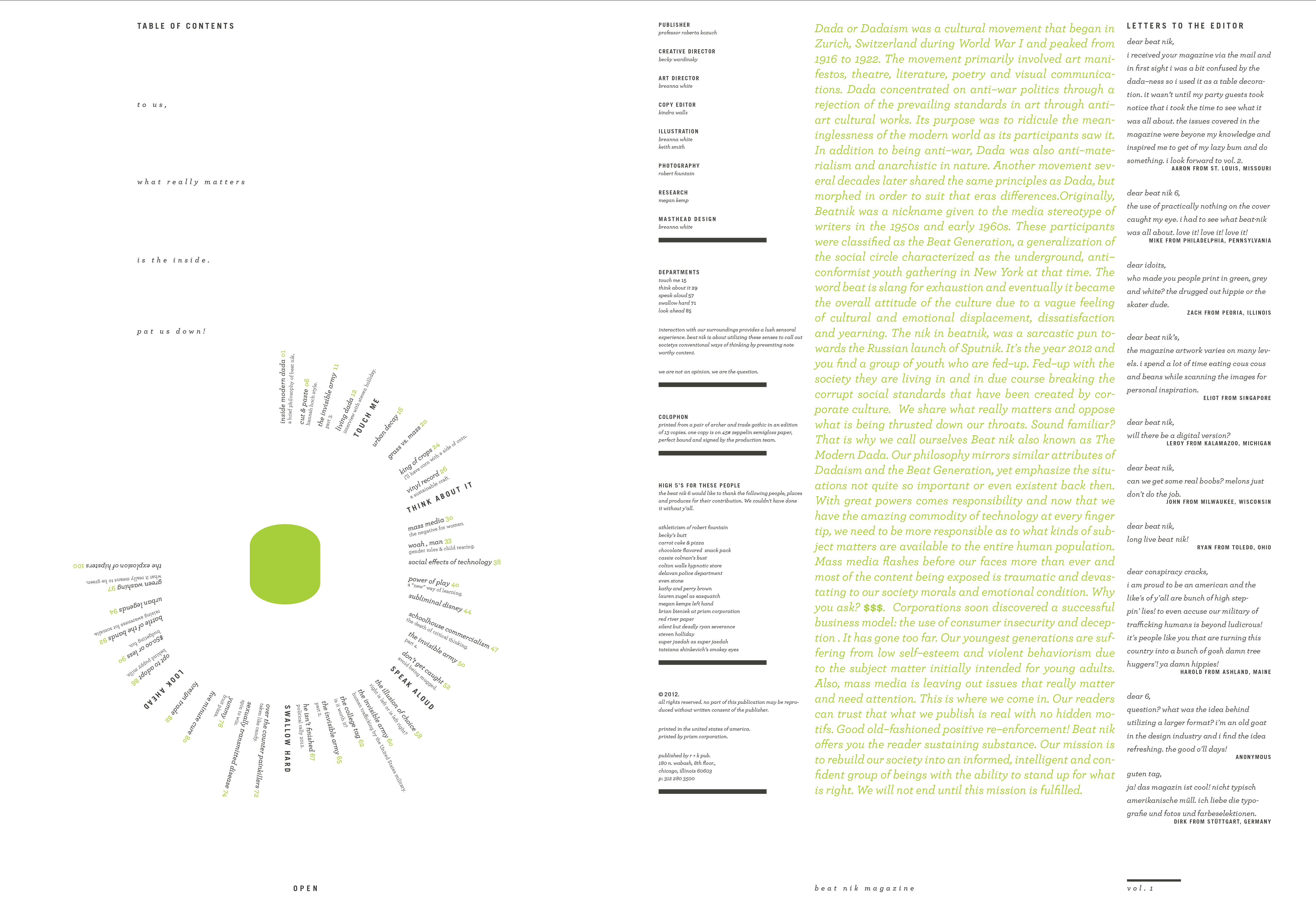
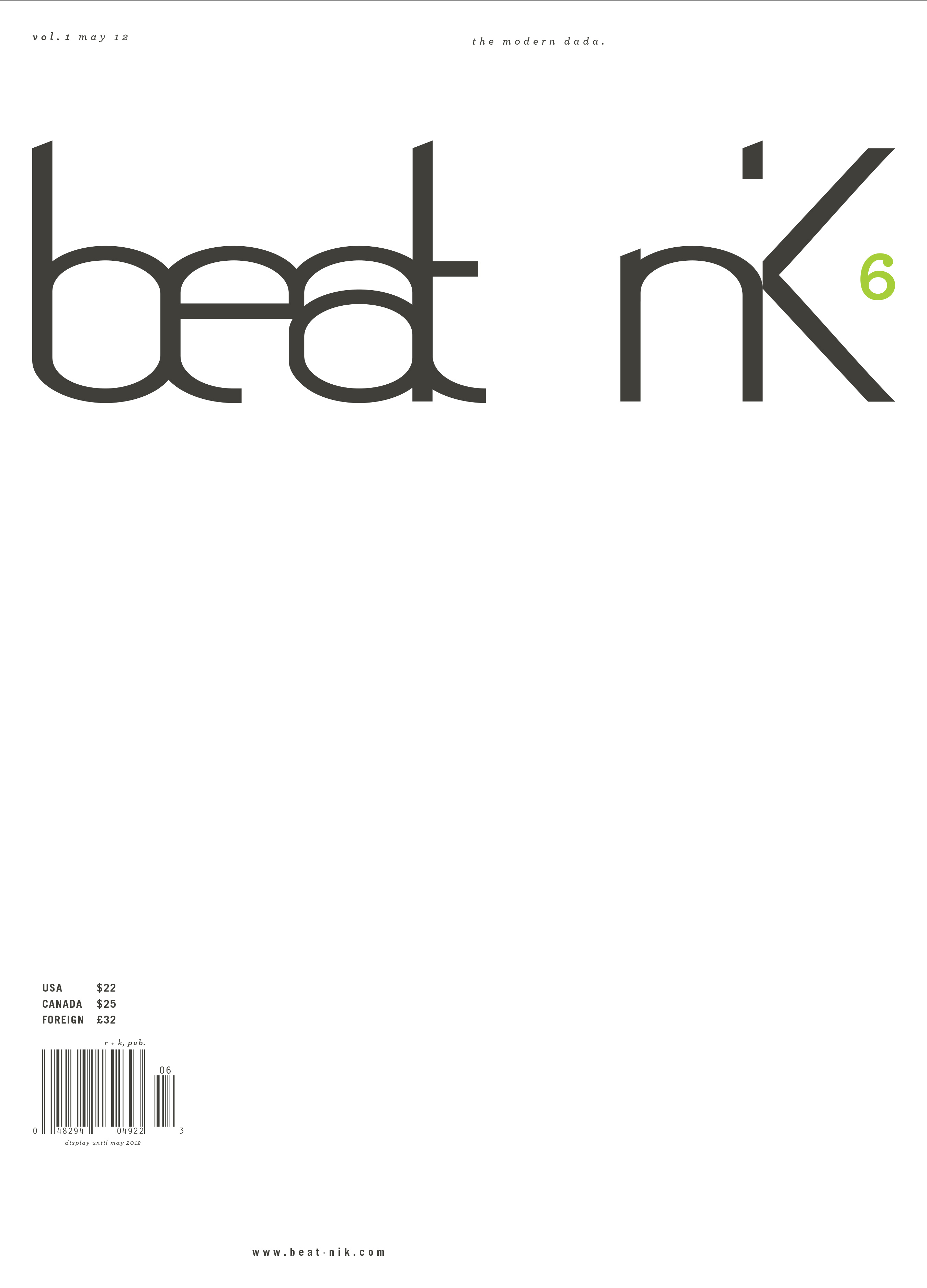
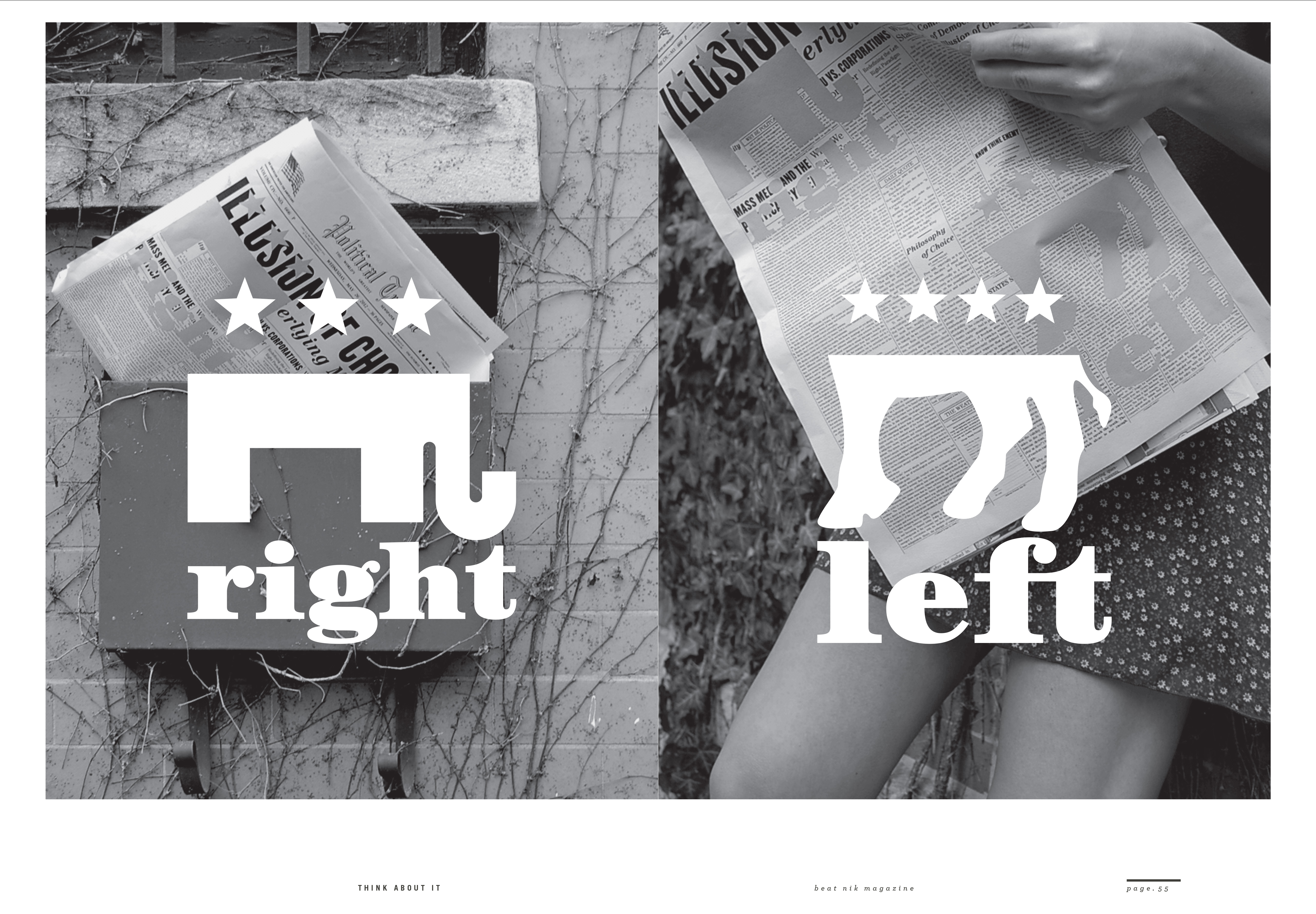
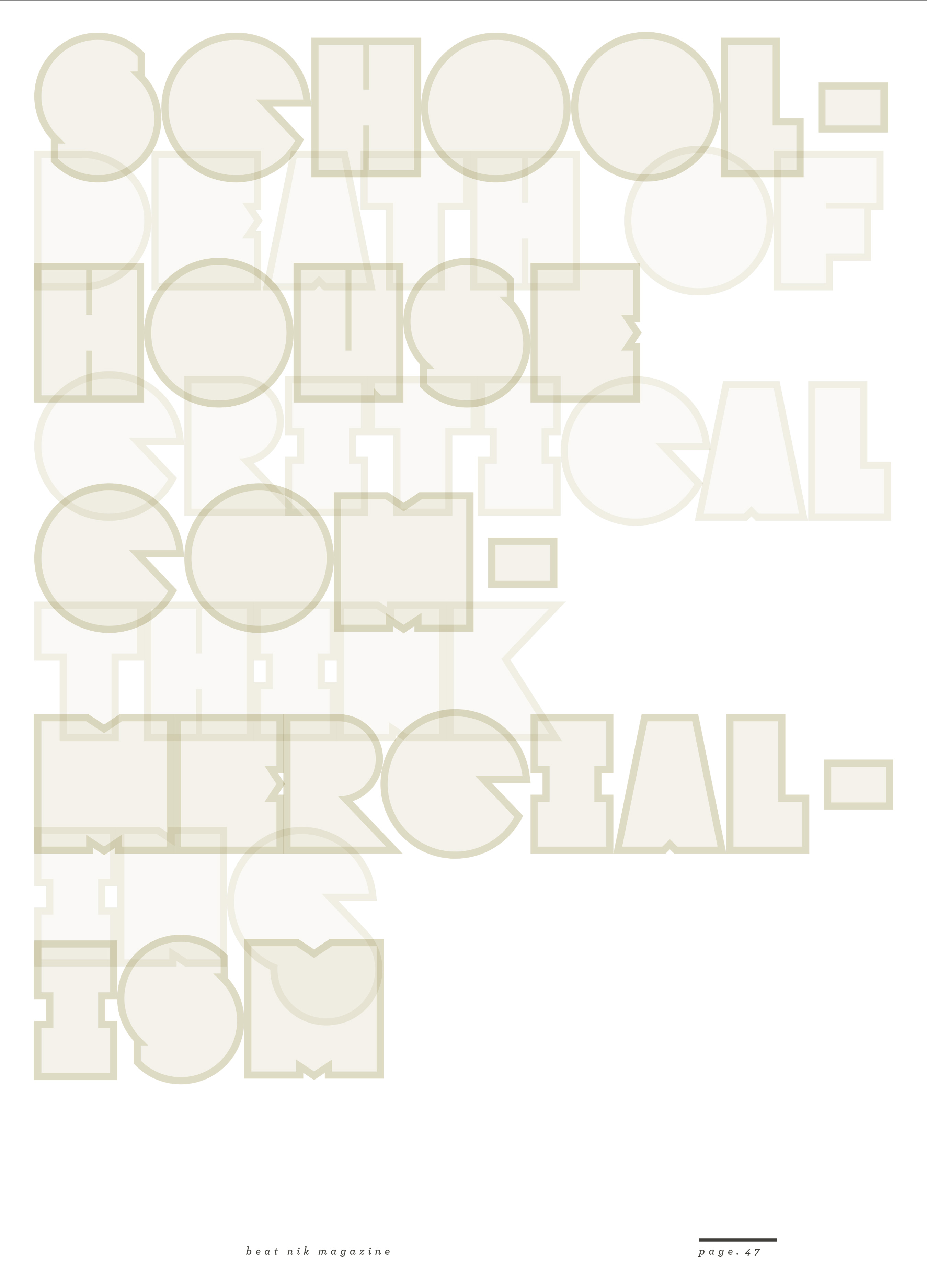
/ Project Brief
A typographic publication for Beatnik that explores the five senses — touch me, think about it, speak aloud, swallow hard and look ahead — as distinct but interconnected experiences. The publication uses typography as both content and visual language, allowing each section to develop its own sensory character while remaining part of a cohesive system. The design direction combines grungy, tactile energy with refined elegance. Raw textures, perfect details, expressive type treatments, and moments of visual disruption are balanced by thoughtful typography, strong composition, and a sophisticated editorial sensibility with a dash of humor. To us, what really matters is the inside. Pat us down!